▼
Sunday, August 25, 2013
My Other Creations: Little Birdie Altered Journal
This week's challenge for the Simon Says Stamp Monday Challenge Blog is to use dots! Wa-hoo! If you've looked at any of my projects, you can see that nobody has to tell me twice to use dots! LOVE THEM! And I also love this Tim Holtz spiral-bound journal that is so blissfully easy to alter. Here's how it started out:
I cut a piece of My Mind's Eye paper (from the Bramble Rose collection) to fit on top. I added some polka dots using a Stampabilities stamp, then smudged on some brown Tim Holtz distress ink to give it a little more dimension.
I used Ranger Black archival ink and added some elegant text using a Stampabilities stamp called, "Le London Script."
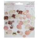
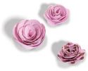
On the top, I tacked on this fun paper dot garland made by Glitz. I glued on some flowers from Petaloo and made a flower of my own using a Sizzix flower die. It's glued on top of a Prima flower.
I added some ephemera elements to the background (from Kaisercraft's Attic Collection), then sawed a bird's nest in half and glued it to the cover. I included some decorative twigs to make a branch for the nest to sit on. I added fabric scraps to a store-bought bird and put him in the nest. I finished it off with yet another flower from Prima and a little ticket stub sticking out of the top to serve as a divider tab.
I used all sorts of random supplies on this project and as always, Simon Says Stamp is my go-to shop for all things crafty. Here's a list of some of the fabulous products I used:
As always, be sure to check out each week's new challenge theme at the Simon Says Stamp Monday Challenge Blog. Not only will you inspire us fellow crafters with your genius, but you'll also be automatically entered to win 50 big bucks to the Simon Says Stamp Store. Free money just for sharing your skills? Go for it!
Saturday, August 24, 2013
My Cards and Tags: Envelope Art
I got the most wonderful surprise in the mail when my best friend from high school sent me a LETTER...and it was HANDWRITTEN. I know! Who does that anymore? It was awesome! Don't get me wrong: I do love how easy it is to stay in touch with people via our electronic devices, but when I saw her handwriting, the curl and slope of her letters, it instantly brought back memories of all those billions of notes we passed to each other in the halls. So when I wrote her back, I tried to add a little extra oomph of my own by decorating the envelope.
I've used this girl stamp before and it has truly become one of my faves: it's from Paperbag Studios (designed by Samantha Kira Harding) and is called, "Sunshine Girl." The background text stamp is another one that I use quite often and is called "Le London Script" by Stampabilities. The reverse polka dot stamp is one that I made from the leftover foam in between some pop-up dots I bought and was kind of fun to experiment with.
For inks, I used Tim Holtz's Distress Inks: Peacock Feathers and Picked Raspberry. I used various greens and browns from Colorbox to accent the edges and wah-lah! Done!
I hope my friend enjoys getting a little bit of personalized paper love with this envelope and her handwritten letter to me made me want to resort to the good old pen and paper a little more often than I do. Thanks, Tracie, for reminding me of the beauty of handwriting, which carries with it the time it took to care.
Sunday, August 18, 2013
My Other Creations: Carnival Necklace
When I was little, I remember that my parents told me we were going to a home improvement show on my birthday. I was so bummed, but tried my best to keep a stiff upper lip. We walked to the convention center and SURPRISE! It was not a home improvement show, but was in fact the Ice Capades! Coolest birthday EVER!
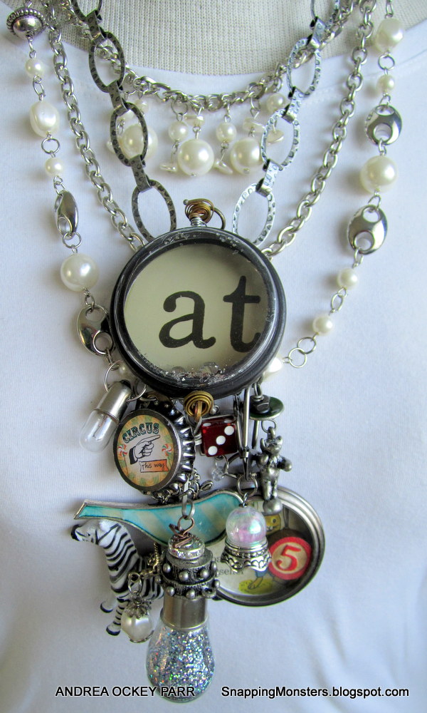
Whether it be the ice capades or circuses or renaissance festivals or musicals, there's something awesome about being a spectator when people are putting on a show. And so to pay homage to the feeling of the theatrical and over-the-top aspects of such shows, I made this big, bold, funky, fun necklace for this week's carnival theme for the Simon Says Stamp Monday Challenge Blog. (Personally, I think there's no such thing as a necklace that's too big and bold!)
As always, if you have a fantastic idea for one of the Simon Says Stamp Monday Challenges (and I know you do), just upload your project and enter yourself to win $50 of shopping goodness at the store that has it all!
Whether it be the ice capades or circuses or renaissance festivals or musicals, there's something awesome about being a spectator when people are putting on a show. And so to pay homage to the feeling of the theatrical and over-the-top aspects of such shows, I made this big, bold, funky, fun necklace for this week's carnival theme for the Simon Says Stamp Monday Challenge Blog. (Personally, I think there's no such thing as a necklace that's too big and bold!)
I tried to capture the sense of whimsicality and excess that surrounds the carnival/circus setting in particular. I'm a major fan of mixed media/metal artist Susan Lenart Kazmer and used several of her pieces for my necklace (the "at" circle, the dice charm, the bear on the ball and the glitter-filled light bulb are all her masterpieces).
I also used several products from Simon Says Stamp to complete the piece. I used Glossy Accents and patterned paper to liven up this bird charm and my husband helped me drill a hole through a plastic zebra (sorry, zebra, but you do look fab!)
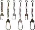
I added a Tim Holtz lightbulb and some Tim Holtz swivel clasps to connect everything. I used a Tim Holtz pocket watch and decorated it with a picture from one of my favorite artists ever: Richard Scarry (the adorable bunny balloon seller) and threw in a Tim Holtz bingo piece.
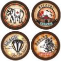
To complete the project, I made a Circus bottle cap charm using both a bottle cap and picture from Bottle Caps, Inc.
I love how crafting supplies can be used for more than just paper projects. Here's a complete list of the Simon Says Stamp supplies that did double-duty for me even in the jewelry world:
As always, if you have a fantastic idea for one of the Simon Says Stamp Monday Challenges (and I know you do), just upload your project and enter yourself to win $50 of shopping goodness at the store that has it all!
Thursday, August 15, 2013
Tutorials: Altering Patterned Paper II
Happy weekend, fellow crafters! You know how I love an altered patterned paper background, so here's my latest creation, followed by the tutorial on how it came to be:
I started out with a piece of striped patterned paper from DCWV. From hard lessons learned, I now start all these types of projects on a surface covered with newspaper or some other table-protecting substance.
Next up, a little Gesso.
And you know how I love me some acrylic paint and vintage book pages! I decided to paint one of the cute little pears to make it stand out more.
Once dry, I added some stamping with this polka dot stamp by Stampabilities and some Tim Holtz Distress Ink and Colorbox ink in shades of green.
Next I trimmed the piece down and added a sentiment with these fantabulous alphabet stamps from Ma Vinci's Reliquary. If you love alphabet stamps and haven't checked out Ma Vinci's before, I would invite you to do so immediately. Be forewarned: drooling may ensue! There are some great fonts available!
Since my page had pears on it, I decided to go with the phrase, "Feed Your Soul." I used Ranger Black Archival ink for the sentiment.
I thought it needed a little something more at the bottom, so I glued some fabric scraps, yarn and flowers to the bottom. I also attached my collage to a piece of patterned paper and adhered the whole thing to an 8x8 canvas. I put fabric around the edges of the canvas so it looked finished if you saw it from the side (thick piece of canvas) and then inked all around it with Tim Holtz Distress ink (Peacock Feathers and Black Soot) applied with a wedge-shaped make up sponge.
For the very final step, I decided to put a pair of glasses on my pear so my pear would look more intelligent. I did this by adding a piece of eyeglass-patterned Washi tape made by Spare Parts. I also added some Washi to the upper left corner (Washi by MME and Recollections).
So there you have it! Another fun adventure with altering patterned paper. Thanks for checking out my blog, loyal readers!
Sunday, August 11, 2013
My Other Creations: Snowflake Crown
When the Simon Says Stamp Monday Challenge Blog issued us with a die cut theme, I was ready to go with my punches and scissors a-blazin'! I adore all of the clever products out there that allow us to be Cut Masters!
Though it is sweltering in my little neck of the woods right now, I still found a use for snowflakes! I decided to make a crown out of a hand-cut snowflake and embellished it with die cut and punched shapes.
A huge kudos goes out to my mom who taught me when I was old enough to hold pointy scissors how to cut a proper snowflake. That's really where this project starts, so here's my way of cutting snowflakes:
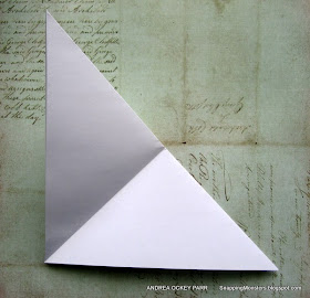
Start with a square piece of paper and fold it in half diagonally.
Fold it in half again so your square will be pyramid-shaped.
Fold your pyramid into thirds, like a pokey ice cream cone.
When you fold it in thirds, you can turn it over and see a straight line. All of your snowflake cuts must stay BELOW this straight line!
Now whip out your scissors and start cutting in from both sides. You have to leave a little of the fold lines on the sides intact (don't cut the folded sides completely away) or your snowflake won't have any connecting points when you open it. The more delicate you want your snowflake to be, the more you should cut out. Here's what mine looks like after cutting it:
And now for the fun part! Open your snowflake and see how it turned out!
There you go! Hopefully the perfect snowflake. I spread mine out for this picture, but if you're going to make it into a crown, leave it folded in half. Then all you need to do is glue it to a plastic headband base, like so (here's a side view):
And here is is from the back:
For this demo, I used simple white paper and didn't cover my headband, but the real magic comes when you use patterned paper and glam it up. A key note to remember, however, is to use lightweight patterned paper so you can manage to cut through all those folded layers.
For my crown, I used some patterned paper from My Mind's Eye and Pink Paislee and then went to town with die cuts and punches. The hydrangeas and butterflies are from Martha Stewart and the flowers on both sides of the butterfly are from Tim Holtz's Tattered Florals die set. I also employed the Fiskars AdvantEdge Punch for some of my edges.
All in all, this was another great challenge from Simon Says Stamp that I thoroughly enjoyed! Here's a list of the supplies I used that you can buy at their mighty fine online shop:
If you, too, are a crafty soul who loves to shop for the latest and greatest, why not enter one of Simon's Monday challenges? You could win a whopping $50 to the Simon Says Stamp online store!