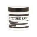
To make this project, I started with a 4x4 cardboard box that had a lid. I took three of the lid's sides off and left one on so the box front could swing open like a door instead of having a lid. I covered the whole thing with white texture paste and applied it with a plastic serrated knife to leave ridges in the texture.
Once the paste dried, I smeared Dina Wakley acrylic paint on it with my fingers. I used Turquoise and Lime.
I added brown paint next.
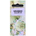
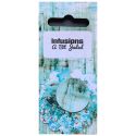
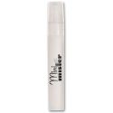
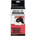
I added Infusions color stain by tapping small amounts on the powder onto my box surface, then spritzing the powder with a Mini Mister. If you add too much water to the powder, you'll get a muddy mess in a hurry. I've learned that less is more when it comes to water and Infusions colored stain. On my box I used A Bit Jaded and Emerald Isle stains. I used a heat gun to speed up the drying process since this box is cardboard and I didn't want to leave it wet any longer than needed.
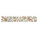
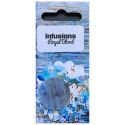
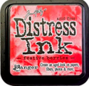
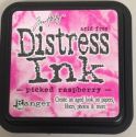
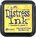
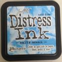
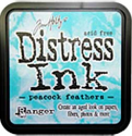
I wanted to make some butterflies to add, so I cut them out of coffee filters using a butterfly die, then dripped alcohol ink on them. I added Distress Ink to the areas that didn't get covered by the alcohol ink, then added Infusions colored stain (Royal Blood) and spritzed them with water.
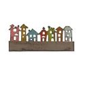
To finish off the front of the box, I cut some houses (Tim Holtz die) and inked them and stamped text on them. I used blended Distress Inks for the color and Ranger Jet Black Archival ink for the text.
I glued everything to the front of my box (including the "Good, better, best" sentiment, which I found in an old textbook).
And now for the inside of the box!
I continued on with my new year's sentiment by spelling out "Prove what is most important." The word "prove" is die-cut with Tim Holtz's Typo lowercase alphabet.
The other side has a background made with rolls of colored silks and another one of my favorite sentiments, "carpe diem."
I'm not one for making specific new year's resolutions because I usually break them all by mid-January, but I figured if I could stick to the one idea of proving what I value most in life through my actions, then that would be a worthwhile pursuit.
Here are the supplies I used on my box, which you can find at Simon Says Stamp:

I'm excited to see how you'll "be square" this week! Upload your creations to the Simon Says Stamp Monday Challenge Blog for your chance to win a $50 voucher to the Simon Says Stamp store!


