Sunday, March 31, 2013

Product Reviews: Lifestyle Crafts- Genius Platform

The theory behind the Genius platform system by Lifestyle Crafts is a bit reminiscent of the Lord of the Rings: "One platform to rule them all." 


 Instead of having to build up all those different "sandwich layers" for your various dies and different machines, the Genius platform only has two layers that you'd ever need to use with your paper and dies/embossing folders: the magnetic base platform and either Mat A or Mat B, OR two Mat B's.  Two layers, kids.  That's it!  That is pretty cool.  And it even tells you on the back of the box what combo you'll need for various brands of dies/embossing folders:


Note, though, that you would have to buy an additional Mat B for your big ole' steel rule dies like Sizzix Bigz.  I didn't realize that at first, but even so, it's still only going to be two layers and that is the beauty of the Genius platform system.  Every time I whip out my Big Shot, I can't remember how to layer it up for different things and have to dig up the instruction manual.  That's why I like the Genius platform system.  Even I can remember the formula for base, die, paper, mat.  I also like how it's long enough to accommodate any 12- inch die. 

Another nifty thing about this system is that it comes with a set of 10 nesting dies.  The whole package is $49.99, but the nesting dies alone would cost $29.99.

Here's what the whole set looks like fresh out of the box:


The big blue rectangle is the base platform and it's MAGNETIC.  So for those of you that love that feature in your Revolution machine (yep, I'm still rockin' the Revolution myself), it works the same way with the Genius platform.  The magnetic feature is great for helping to keep your dies and paper lined up.

To see some examples of it layered, here you go!  For everything except chunky steel rule dies (old school Sizzix or Sizzix Bigz, etc.), you put the die or embossing folder on the blue base (make sure you put the cutting side up!), add your paper, then top it off with either Mat A or Mat B.  DONE.  Here's a picture of a Spellbinders die being cut with Mat A:


And here's how it came out:


As you can see, it cut clean and sharp.  The platform is totally solid-- very high quality and I had no problems running it through the Big Shot.

Here's another example of how it handles an embossing folder.  Again, I just used the blue platform base, put my paper in my folder, then topped it with Mat B:


Here's how it turned out:


Very deep grooves and again, no problems at all with sending it through the Big Shot.

As another side note, I did some online research to see if the mats had a "face-down" side or not and it didn't seem to matter.  People used them both ways.  The only thing you have to make sure you do is to put the die in with the cutting side up.  Beyond that, it doesn't matter which side of Mat A or Mat B you put face-down.

Check out the Lifestyle Crafts website to see if the Genius platform is right for you (wow-- I just sounded like one of those medication commercials!!  Sorry about that!)  It really is a great product (in my opinion) and has allowed my brain to use up its precious memory space on things more important than how to layer my Big Shot machine.  

And hey-  if you do decide to buy, make sure you use my savings code (SNAPPING) so you can score yourself a sweet 20% off.

Sunday, March 24, 2013

Product Reviews: Spectrum Noir Markers Review

For quite some time, I've been searching for a good quality alcohol marker that wouldn't break the bank.  Enter Spectrum Noir!


But let's back up and start with the basics: how are alcohol markers unique and what can they offer us crafty folks?  Alcohol makers have alcohol-based dyes which allow you to blend the colors together without your paper getting destroyed (like they might with other types of markers when you try and layer colors).  They're a little more "juicy," than other markers, if that makes sense, which allows you to have the colors (ideally) blend together seamlessly like water colors.  They can be a great tool to use to color in stamped images.

The most well-known brand of alcohol markers are Copic markers, which pretty much set the standard in the field.  Copic markers will cost you about $7 a marker and I didn't want to fork over that kind of money right out of the gates.  That's when I went to JoAnns and saw these Spectrum Noir markers and decided to give them a whirl.  Spectrum Noir markers are only about $1.99 per marker and they come in sets of six.  If you use a 40% off coupon, it's a great deal and it's nice that they come packaged in "color families" to save you the effort of trying to figure out which shades blend together.

Each Spectrum Noir marker has two ends, labeled "broad" and "fine," which you can see below:


You also may notice the square body shape, which is handy if you have a bunch of them on your desk (no stray roll-away markers)!  The lid of each marker (on both ends) is colored and labeled, so that's also a plus.  It's also nice that the marker is labeled as to which end is which.

I bought a few different sets and here is my first Spectrum Noir experiment: a digital stamp from Octopode Factory (artist: Lily Chilvers) that I colored in:


After having used these Spectrum Noir markers, here are some pro's and con's, as well as some advice if you're going to try them out:

1.  Be careful of the markers that are "extra juicy."  While I understand that this is necessary to help them blend, the colors bled a bit more than I anticipated (such as how the flesh color went into her eyeball).  It seemed like some markers were way juicier than others and I had to get to know each marker specifically to figure out how it would blend. 

2.  They are kind of hard to open.  I'm a healthy non-arthritic person, but even my hands got a little tired of yanking the lids off and snapping them back on just right.  Granted, I did this about a billion times because I was experimenting with every single color, but still.  My fingers stayed cramped in "lid pull off position" after awhile.  I know that they have to seal tightly so that they don't dry out, but maybe a more ergonomically friendly design could help.

3.  If the store will allow you to, open the package you're going to buy and try out both ends of each marker before you leave the store!  When I initially bought these, there were several that were dried out, so I had to return them.  JoAnns was cool about it and let me exchange them and test the new packs out before I left, but beware that some could be dried out, which was not a pleasant discovery.

4.  Other than those cautions, I would recommend Spectrum Noir markers to those who want to see if they like alcohol markers, but don't want to commit to the pricier Copic markers.  If you want an "introductory marker" that lets you see how they work, but doesn't break the bank, these are ideal.  They blend well, the color families have some beautiful shades, you can buy refills for every color, and they are super budget-friendly.  

5.  Lastly, whether you decided to go Spectrum Noir or some other brand, an absolute lifesaver for me was to make a color guide first and then keep the markers stored in their respective color families.  The guide doesn't have to be fancy, but it saves a ton of time when you want to know what the marker shade will look like.  Here's the quick one I did:


Bottom line?  Go for the Spectrum Noir if you want to test out some alcohol markers but don't want to pay for pricier brands.  They're easy to use and I've been pleased with the results.  Try just one pack and see how they work.  After all, you can always upgrade later if you become addicted to using alcohol markers and if you don't end up liking them, at least you haven't wasted lots of moo-lah.

Thursday, March 21, 2013

My Cards and Tags: Bird Tag

I'm still so excited about Spring even though it SNOWED today.  What???  I know.  Slush did not go well with my open-toed heels at all.  Be that as it may, I've still been trying to get my Spring on when it comes to my cards and tags!

Here's a tag I made using an absolutely adorable bird die from Lifestyle Crafts.  I also made the tag itself from a Lifestyle Crafts die featured in the Tag It Kit (one of my all-time faves).  LC has some cool stuff happening right now (hint: the genius platform), so if you haven't checked their website out lately, give it a whirl! 


The paper I used is from My Mind's Eye, Memory Makers and DCWV.  The flower is from Prima and the twine is from American Crafts.  I added a little strip of fabric and some lace and it was done!


Tags are such a quick and fun form of art and they're always coming in handy to stick on little gifts or treats.  If you're feeling overwhelmed by a 12 x 12 page staring you in the face, try a tag instead!  Another plus to tags is that if you totally botch it, you've only wasted a small amount of paper!  :)

Tuesday, March 5, 2013

My Cards and Tags: SOUS March 6th Card Challenge

Another card sketch from Stuck on U Sketches!  This was a unique sketch and it yielded a card that I certainly hadn't planned on making!  I ended up with a baby boy card, but it has roses and a bow.  So while the "manly verdict" may still be out, I liked the finished product.


Here's the sketch by Sandi that I based my card on:


As you can see, I flipped the sketch horizontal for my card and moved the location of the bow.  I used My Mind's Eye paper (surprise, surprise- love MME!) as well as some paper from Pink Paislee.  The big sentiment in the center is a design I cut out from one of the My Mind's Eye pages.  I stuck a piece of Washi tape at the top.  The Washi's from Target.


I made the scalloped bottom portion with a fantastic edge punch from EK Success.  I tied a bow out of some American Crafts ribbon, inked it and I was done!


I know I say this every time I make a card from one of the SOUS sketches, but I truly love the challenge of seeing how I can fill in someone else's wonderful sketch idea!  Kudos to the designers at the SOUS blog!

Sunday, March 3, 2013

My Other Creations: St. Patrick's Day Pinch Prevention Kit


We all have those friends in our lives who need a little…help.  You know who they are!  They’re the friends who come to the party two hours late with mismatched socks or who lose their keys five times a day or who sometimes don’t know what day it is at all.  Late, lost and often deemed clueless, these friends might not be punctual or organized, but they are usually the most fun, creative and spontaneous people you’ll ever meet!  Some of my best memories involve these somewhat flighty friends.  


It was with these friends in mind that I created the “Pinch Prevention Kit.”  It is the perfect gift for anyone in your life who may be in peril of being pinched because they perpetually forget when St. Patrick’s Day is.   


I made this kit from a tin that I embellished with fabric scraps, ink, stamps and a flower.  And when you open it, here are the pinch prevention items that are neatly nestled inside: green nail polish and a green ring.


Armed with these green goodies, your forgetful friends will be able to green-i-fy themselves in no time when the special day comes and pinching fingers are flying!  Because hey, even if these friends aren’t perfect, we love them and don’t want them getting pinched!  

This project was a lot of fun and was also the first project I made for the Crafting Ireland Online magazine.  This is a condensed post, but if you want to see the full article, along with step-by-step instructions of how to make this kit yourself, head on over to Crafting Ireland and check out the new issue!  This project is on page 24, but the whole issue is packed with a lot of really good stuff (and I don't just say that because I'm in it)!

Tuesday, February 19, 2013

My Cards and Tags: SOUS February 20th Card Challenge

Well kids, it's time for another fantastic card challenge from SOUS (Stuck On U Sketches)!  Have you checked out the SOUS blog yet??  I'm telling you-- I'm a believer!  I never used card sketches much until I discovered their blog.  Now I always look forward to their card sketches and love to "fill in the blanks," as it were.  So here's the card I created....


....from Leah Schaeffer's sketch (she's awesome, by the way):


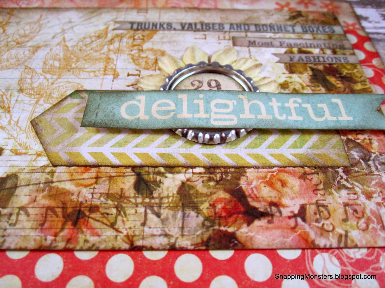
For my card, I used paper from Recollections and Pink Paislee.  I also threw in a Prima flower (cause you know by now that's just how I roll) and a bottle cap from The Paper Studio.


The cool thing about the bottle cap is that it's pre-flattened.  Not that I don't enjoy getting out my aggression by smashing a bottle cap every now and again, but I thought these were kind of a nifty variation.

I've included a dimensional shot so you can see how nice and flat the bottle caps are:


All of the text on this card was cut out from printed pages and of course, I had to finish it off with polka dots.

Thanks again to the ladies who run the SOUS blog and for my fellow Design Team members.  They're always inspiring!

Tuesday, February 5, 2013

My Cards and Tags: SOUS February 6th Card Challenge

Ahhh February!  Love is in the air, but I must say that it's easy for this holiday to be a little heavy on the romantic cheese.  I absolutely adore the soft shabby chic look, but for this particular "romantic" card, I wanted to try and make it look...grungy-ish instead of lovely-dovey just to mix it up a bit.  So here is the card I came up with:


My card was based on this fine sketch from the ever-talented Leah Schaeffer:


For my card, I used paper from Tim Holtz, My Mind's Eye, Basic Grey and the Paper Studio.  The clock image is also from Tim Holtz (I cut it out of a piece of clock-patterned paper).  The flowers are from Prima and the adorable little heart clip is from Recollections.


To finish it off, I stamped the "any time / anywhere" sentiment with alphabet letter stamps from EK Success and Studio G.  I'm always fond of alphabet stamps because you have the freedom to spell out whatever you want.


This was a fun sketch to work with and I enjoyed exploring sort of a new "look" for a romantic-themed card.

Sunday, February 3, 2013

My Cards and Tags: True Love

So I whipped out my Valentine's decor the other day and it was looking a little...sparse.  I wanted something new to put on the entryway table, so I decided to make a Valentine's card, then frame it!  (Picture a triumphant "Duhn-duhn-duhn-duuuuuhn" sound right now)!  I know- the idea of framing a card is not rocket science, but for some reason, I've never done it before.  So may I proudly present my framed Valentine's card:  


For this piece, I used a lot of supplies from the Love Note collection by Fancy Pants Designs.  LOVE what they come up with!  The background paper is from that collection, and then I shot a spritz of "pretty pink" color mist on it (Mister Huey's brand).

I used a Chevron stripe sticker (also from Fancy Pants) and layered two pieces of fabric on top of it.  I punched a heart out of some pink corrugated paper (yep-- Fancy Pants again) and stuck it behind my sentiment.


To embellish, I added a mini pink binder clip and attached a Fancy Pants "true love" sentiment sticker.


Wah-la!  Done!  And I must say, framing my first card was rather satisfying.  I decorate my craft space with my own artwork and projects all the time, but this framed card is the first piece of my artwork that's oozed into the main living area of the house.  Kind of a cool little milestone!

And hey- you know what February means, right?  It means we are only ONE month away from the Scrapbook USA Expo!!!  Yipppeeee!  Don't forget to mark your calendars, pack your bags, or do whatever else needs to be done to be ready for the Expo that will happen on March 22nd and 23rd in Utah!  It will be epic, as always, and Fancy Pants (along with so many other inspiring brands) will have their wares up for grabs.  Check out the Scrapbook USA Expo website for all you need to know to take part in this crafty extravaganza.

Friday, February 1, 2013

My Cards and Tags: Stuck On U Sketches 100th Sketch Blog Hop


Welcome, welcome to the SOUS 100th Sketch Blog Hop!  How fun is it to see all the projects these talented ladies came up with based on the same sketch??  If you made it here, you've come from Annette's blog and I am the last on the list!  If you stumbled here randomly and don't know what in the heck I'm talking about, then head to the  Stuck on U Sketches blog to start off right!

Without further ado, here is my card:


My card was based on this sketch, which I admittedly took a few liberties on.


For starters, I decided to scoot the rectangles over to the side so that they overlapped instead of being spread out (what can I say?  I was having space issues!)

I also brought in some fabric and used a pastel palette to give it that romantic vibe.


As for materials, the stick pins are from Maya Road, the paper is from Kaisercraft and Prima and the lace flowers are from Recollections.  The sentiment is actually from a piece of fabric that had a bunch of text sayings on it.  I cut it out and added it to the card.  I finished everything off with a little Tim Holtz distress ink.


All in all, what a great blog hop it's been!  Congrats to Stuck on U Sketches for 100 fantastic and inspiring sketches!  

Now that you're done, make sure you go back to the SOUS blog and leave a comment that you've finished the hop!

Saturday, January 19, 2013

My Cards and Tags: Chalkboard Bird Card

I have seen SO many adorable chalkboard cards lately!  Some of them are computer-generated, but I thought I'd try my hand at the chalkboard look.  Here's the result:


Since this was my first chalkboard attempt, I don't know what's "right" or "wrong," but I can at least tell you what I did.  I started with a piece of DCWV black cardstock and VersaMagic ink in the shade of "Cloud White."  

The stamped image is actually two stamps.  The bottom part (the "Friends Forever" sentiment), is from TPC Studio and I bought it at JoAnn's.  The bird part is from Lost Coast Designs.  I stamped them onto the black cardstock with the VersaMagic ink, then shook on some opaque white embossing powder ("Snow") from Recollections.  After shaking off the excess powder, I shot it with my heat gun for the raised embossed look.  

I dabbed a Kleenex into the white ink, then smudged and rubbed it onto the black cardstock for that erased chalk look.  I finished off the card with some patterned paper from My Mind's Eye and 7 Gypsies and a paperclip.

The chalkboard look has definitely been a fun trend to see and there are all sorts of variations you can do with it.  I look forward to exploring it more!